


A sales one-pager works when a busy buyer can understand your offer, believe it and know the next step in under a minute. Design is how you get there: one message, a clear hierarchy, proof placed where doubt appears, and a single call to action. This guide covers what to put on the page, how to lay it out, what good examples have in common, and how to make the page work alongside your video and photography.
TL;DR
- Define the one action you want the reader to take before you design anything. That decision determines what stays and what gets cut.
- Open with the buyer’s problem and a specific outcome headline, then add two or three differentiators and one or two credible proof points.
- Use a single 8.5 × 11-inch side, generous white space, visible headings and bullets so the page scans in seconds.
- Match the call to action to the buyer’s stage and name a real contact.
- Support the page with real visuals: product imagery, team photos and a short video link or QR code beat generic stock.
Table of Contents
- What a sales one-pager is supposed to do
- What to include on a sales one-pager
- Layout: how to make the page scan in seconds
- Write the value proposition first
- Visuals that carry the argument
- Sales one-pager examples: structures worth copying
- When to send it
- Our perspective: treat the page as part of a system
- Put real visuals on your page
- Common design mistakes to avoid
- FAQ
- Sources
What a sales one-pager is supposed to do
A sales one-pager is a short, shareable document that moves a deal forward. Dock describes it as a one- to two-page summary of what a product does, why it matters and how it solves a specific problem, built to be easy to skim, share and act on. Shopify frames it as a concise leave-behind that helps a prospect grasp value quickly and gives them a clear path to the next step.
That last part is the design brief. The page is not a brochure, a company history or a spec sheet. Zapier’s guidance is to define the action you want the reader to take before writing, and to let that objective decide what goes in and what is left out. A one-pager has to let people extract what they need quickly, which means making deliberate cuts.
Before opening a design tool, write down three things:
- Who reads it. A procurement lead, a marketing director and an event sales manager each need different proof.
- What they should do next. Book a call, request a quote, watch a demo, approve an internal forward.
- What they already know. A page sent after a discovery call can skip the basics. A leave-behind at a trade show cannot.
What to include on a sales one-pager
Guides from different publishers phrase the list differently, but they converge. HubSpot’s guide names seven core elements: logo, a brief about statement, a problem statement, features and benefits, social proof, a call to action and contact information. Edithly condenses it to six blocks: an outcome-focused headline, the buyer’s problem, a concise solution, proof, differentiators, and one clear call to action with a named contact.
Here is how those pieces map to a working page.
| Block | What it does | Design note |
|---|---|---|
| Headline | States the result the buyer gets | Largest text on the page; outcome, not product category |
| Problem | Shows you understand their situation | One or two sentences in the buyer’s own words |
| Solution | Explains how you solve it | Two or three steps or a simple diagram |
| Benefits | Ties features to outcomes | Three to five short bullets |
| Differentiators | Explains why you and not an alternative | Two or three that the buyer actually cares about |
| Proof | Removes doubt | Logos, a short testimonial, a result with a number |
| Call to action | Names the next step | One action, one named contact |
Proof that earns trust
HubSpot recommends social proof such as testimonials, statistics or awards to back up your claims. Dock adds a useful discipline: use customer logos, a short testimonial or a case-study link, and favor credibility over clutter. One strong proof point beats five weak ones. If you can only show a single result, make it specific. Brazn AI recommends quantified outcomes rather than vague claims about improved productivity.
Pricing, security and compliance
Pricing is optional and depends on deal stage. Dock notes that pricing can be included when it fits the stage of the deal, and that security or compliance details can remove IT and procurement roadblocks. For a first-touch page, a clear next step often works better than a number without context.
Layout: how to make the page scan in seconds
People rarely read a sales page line by line. Nielsen Norman Group’s guidance for scan-oriented content is to put the most important points first, use distinct headings and subheadings, group related content, bold key words, use bullets or numbered lists and remove anything unnecessary. Those rules translate directly to a one-pager.
Format and structure
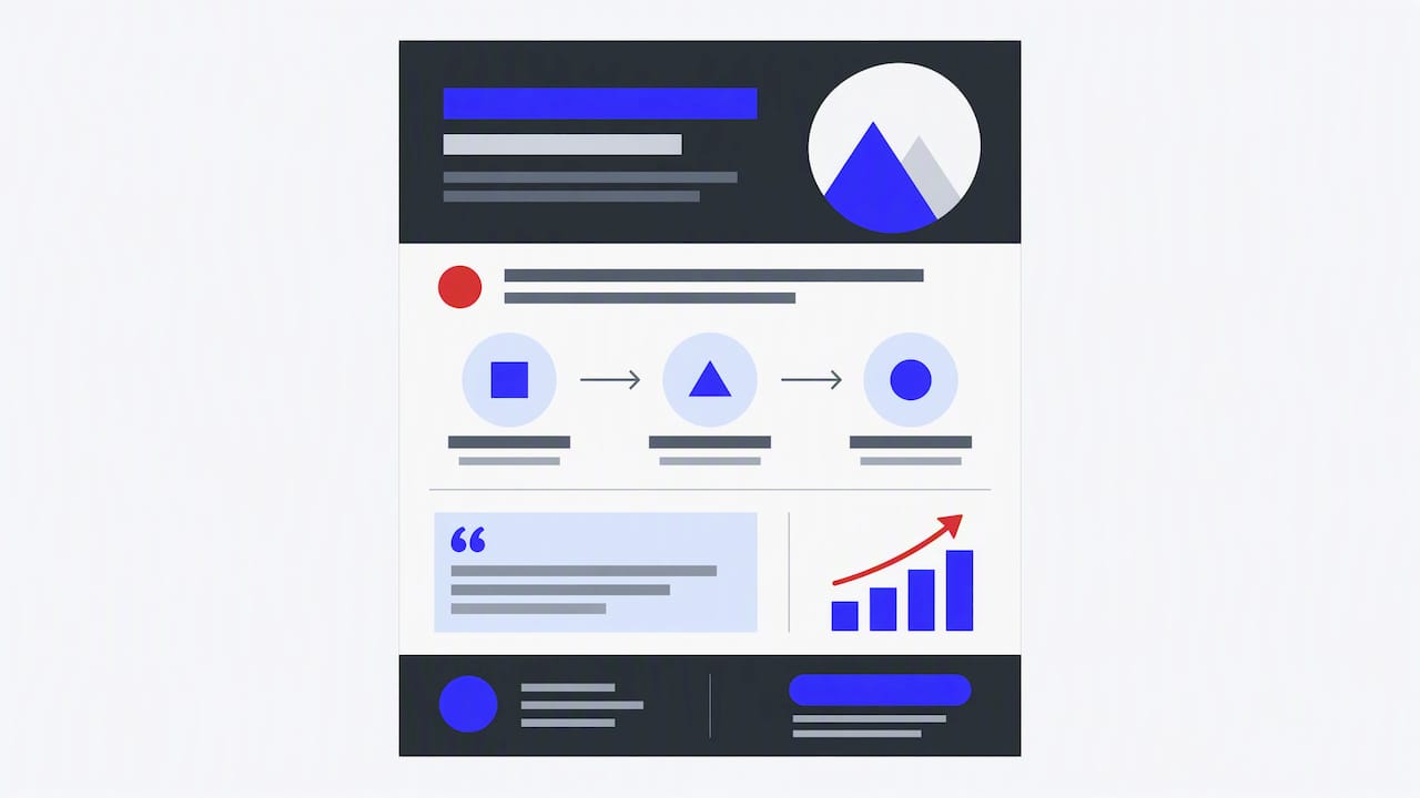
Stick to one side of a standard 8.5 × 11-inch page, which prints cleanly and attaches to an email without friction. Then organize it in three zones, following the header, body and footer approach Grammarly describes:
- Header: logo, headline and a one-line overview.
- Body: problem, solution, benefits and proof.
- Footer: call to action and contact details.
A simple two-column body works for most B2B offers: the left column carries the problem and solution, the right carries benefits and proof. For services like video production, a wide image band between header and body works well because it shows the work before describing it.
Hierarchy, type, color and spacing
Presentations.ai identifies three ingredients shared by strong one-pagers: logical layout, content hierarchy, and deliberate typography, color and spacing. In practice:
- Use no more than two typefaces and three sizes: headline, subhead, body.
- Give each block a visible heading so the eye can jump.
- Leave margins and gaps larger than feels necessary. White space is what makes a dense topic look easy.
- Use one accent color for the call to action and nothing else, so it is the first thing the eye lands on after the headline.
- Write in the active voice. Grammarly points out that it keeps copy shorter and supports skimming.
Check the eye path
Print the draft, hold it at arm’s length and squint. You should be able to trace a path from headline to key points to the call to action. If your eye stalls on a logo wall or a paragraph, move or shrink it.
Write the value proposition first
Design decisions get easier once the message is right. Dock’s advice is to start with the buyer’s problem and state the value as a specific outcome, then explain the solution briefly, connect features to pain points, and finish with a next step and a named contact.
The headline carries most of the weight. Edithly’s example of an outcome headline, quoting spot loads in minutes instead of hours, shows the pattern: a result the buyer can picture, not a product label. Compare these two headlines for a video production offer:
- Weak: “Corporate Video Services”
- Stronger: “Event highlight videos your sales team can use within days of the show”
The second tells a specific buyer what they get and why it matters. Keep the body customer-centered too. As Storydoc argues, the page should connect the prospect’s pain points to your solution rather than make your company information the main story.
A quick test: cover your logo. If a competitor could print the page with their logo on it, the copy is too generic. Replace claims with specifics: the audience you serve, the format you deliver, the outcome you aim at.
Visuals that carry the argument
Images should do work, not decorate. Use them to show the offering, explain a process or prove quality.
- Product or service imagery. Show the real thing. For a service business, that means finished work: a frame from a brand film, a shot from an event, a team portrait.
- Diagrams for the solution. Edithly recommends two or three steps or a simple diagram instead of a feature list. A three-step strip (brief, shoot, deliver) is easier to absorb than a paragraph.
- Numbers as charts. One clean figure or small chart gives context to a statistic faster than a sentence does.
- Icons. Use them sparingly to separate benefits, not to fill space.
This is where original photography and video stills pay off. Generic stock photos signal a generic offer. Branded images of your own team, product and customers make the page feel specific. If your leadership or sales team appears on the page, consistent corporate headshots keep it credible and on-brand.
A printed page cannot play video, but it can point to one. Add a short URL or QR code to a 60 to 90 second explainer or demo. If you are planning that kind of asset, our guide to product demos that drive sales covers how to structure one.
Sales one-pager examples: structures worth copying
Rather than showing a single template, it helps to see how the same blocks flex by situation. These are structural sketches you can adapt, not case studies.
Services leave-behind
A services firm leaves this after a meeting. Headline names the result. A short problem line sits under it. A three-step process strip shows how the work happens. A row of client logos and one testimonial sit beside a single result. The footer has a named account lead, a phone number and a “Request a quote” line. Shopify notes the call to action should match the prospect’s stage, such as booking a demo, starting a trial, requesting a quote or contacting sales.
Product one-pager for a demo follow-up
A software or hardware seller sends this after a demo. A product screenshot or photo leads. Three benefits sit below, each tied to a pain point the buyer mentioned on the call. The proof block holds a review rating or adoption figure. The call to action asks the champion to forward the page to finance or IT, with a line on security and compliance for the people who will review it.
Event sponsorship one-pager
An event organizer sells sponsor packages. The headline states the audience and the outcome for sponsors. A photo band from the previous year shows the room. Attendance, audience mix and sponsor deliverables fill a compact table. Our breakdown of event sponsor video deliverables shows the kind of content sponsors expect to see promised, and a one-pager is where you spell it out.
What they share
Across all three, the pattern matches what Presentations.ai describes: logical flow, clear hierarchy and careful typography, color and spacing guide the reader from headline to key points to the next step. No sketch tries to say everything.
When to send it
Timing matters as much as design. Edithly suggests sending a one-pager after a discovery call, before a meeting, after an event or demo, to a champion for internal forwarding, or during renewals. It cautions against using it as a cold first-touch attachment and recommends earning a response first.
Build one master version, then make variants for each moment. The post-event version can lead with a photo from the event itself. The renewal version can lead with results delivered.
Our perspective: treat the page as part of a system
We see one-pagers fail for the same reason many marketing assets fail: they are designed in isolation. A page with a sharp layout but weak proof, or strong claims but no way to act, will not move a deal.
Our approach to creative work starts from business outcomes. We ask what the page needs to produce, whether that is a booked call, a sponsor signature or a forwarded email, and then work backward to the message, the imagery and the layout. Because we produce video and photography as well as design, we can plan the visuals and the page together, so the stills on your one-pager, the clip behind its QR code and your landing page all say the same thing.
Measurement belongs in that system too. Give the page a dedicated link or QR code so you can see what it generates. Our guide on measuring video leads walks through the approach, and the landing page the QR code points to deserves the same attention; see how to optimize landing pages for more leads.
— Brandon V
Put real visuals on your page
If your one-pager relies on stock imagery, the fastest upgrade is a focused shoot: team portraits, product or service shots and a short video that the page can link to. We produce corporate and marketing video and corporate and marketing photography for businesses and event teams across the United States, working through a nationwide network of crews.
Tell us the audience and the action you want the page to drive, and we will plan the shot list around it. Learn more about our business promotional video production or reach out through v2visuals.com.
Common design mistakes to avoid
- Too many messages. If you sell five services, make five pages or choose the one that matters to this buyer.
- Feature lists with no payoff. Every feature needs a benefit next to it.
- Buried call to action. It should be visible without reading anything else.
- Anonymous contact. A generic info address gives the reader no one to answer to. Name a person.
- Unverifiable proof. Skip claims you cannot back with a customer name, a number or a link.
- Tiny type to fit more. If it does not fit, cut content rather than shrinking the font.
FAQ
How long should a sales one-pager be?
One side of a standard 8.5 × 11-inch page is the common recommendation, and HubSpot advises it for easy printing and sharing. Some sales teams allow two pages, as Dock’s definition notes, but if you need the second page, check whether you are trying to say too much.
What is the best layout for a one-pager?
A header, body and footer structure is the simplest: branding and headline on top, problem, benefits and proof in the middle, call to action and contact at the bottom. Use visible headings, bullets and white space so readers can scan, following the scan-friendly practices NN/g outlines.
Should I include pricing?
Only when it helps at that stage of the deal. Early-stage pages usually work better with an outcome and a clear next step, such as requesting a quote. Later-stage pages for a buyer who has already seen a proposal can include pricing or package details.
Can I send a one-pager as a cold email attachment?
It is usually weaker than sending it after you have earned a reply. Edithly recommends getting a response first and then sending the page, when the buyer has context for it.
What should the call to action say?
One specific step that fits the buyer’s stage, with a named contact: book a call, request a quote, watch the demo. Avoid offering several choices on the same page.
Sources
- 17 Sales One-Pager Examples (+ Tips & Templates), Dock
- 18 one-pager examples + templates, Zapier
- One-Pager Examples & Free Template for Business, Shopify
- Create a Sales One-Pager, Storydoc
- Writing the Ultimate One-Pager About Your Business, HubSpot
- Sales One-Pager: The 6 Blocks Every One Needs, Edithly
- What Is a Sales One-Pager?, Brazn AI
- F-Shaped Pattern of Reading, Nielsen Norman Group
- 7 Things to Include in a One-Pager, Grammarly
- One Pager Examples That Get Results, Presentations.ai