



The best brand guidelines examples share one trait: they let someone who has never met your design team produce work that looks like it came from you. That someone might be a videographer on an event shoot, a sales manager building a deck, or a freelancer cutting a social ad. Below you will find examples worth studying, what each one teaches, the components every guide needs, a checklist you can use to build or review your own, and how to extend your guide to video, photography and live events.
TL;DR
- Strong guides pair rules with visual proof: correct and incorrect usage side by side, real applications, and downloadable assets.
- Core components are brand foundation, logo, color, typography, imagery, voice and tone, application templates, and governance.
- Most guides stop at print and web. Add photography, video and event standards so every crew you hire shoots on-brand.
- A guide without an owner and an update routine goes stale. Name a person, set a review date, and keep assets in one place.
- Cost depends on scope, not page count: channels, depth of templates, and whether motion and photo direction are included.
Table of Contents
- Brand guidelines examples worth studying
- What great guidelines have in common
- What to include in brand guidelines
- A brand guidelines checklist
- Extend the guide to video, photography and events
- Keep it alive: governance and updates
- What does a brand guide cost?
- Put your guidelines on screen
- FAQ
- Sources
Brand guidelines examples worth studying
You do not need to copy a global brand’s 200-page manual. You need to see what each one solves, then borrow the idea that fits your size. These are the examples our team points to, and the lesson in each.
AIGA: one system, many personalities
The professional association for design published identity guidelines in December 2015 that set a shared visual system for national and chapter materials while still allowing chapters their own personalities. The lesson: a guide can be firm about the core and flexible at the edges. If your company has regional offices, product lines or event series, decide in advance which elements are fixed and which can flex.
Apple (1993): the power of restraint
Apple’s May 1993 standards focus on consistent use of the logo, signature, typeface, colors and white space, including specific clear-space rules around the logo. It is old, and it is a useful reminder that a guide does not have to be big to be effective. A handful of non-negotiable rules, stated precisely, beats a sprawling document nobody opens.
Bang & Olufsen: a guide built as a working tool
Frontify’s roundup of notable brand guidelines describes Bang & Olufsen’s online hub as elegant in a way that reflects its products, with search, downloadable assets and templates that support self-service. The lesson is about access. When a partner can find the right logo file in thirty seconds, they stop guessing or grabbing the nearest screenshot.
Cash App and IBM: guides that keep moving
The same roundup points to Cash App’s exploratory canvas and IBM’s “what’s new” section. Both treat the guide as a living product rather than a PDF filed away after launch. A short update log tells your team and your vendors what changed and when, which keeps older files from circulating.
What the examples add up to
The same roundup notes that some brand portals let non-designers create on-brand materials from templates and approved assets, which reduces routine requests to design teams. For a marketing team of five, that is the practical payoff: fewer review rounds, faster turnaround, and less drift.
What great guidelines have in common
Across these examples, a few patterns repeat.
- Rules come with examples. A statement like “keep clear space around the logo” lands harder with a diagram and a do-and-don’t pair.
- Everything is findable. Assets, templates and contacts live where the people who need them already look.
- They cover real use cases. Not just the logo on a white page, but a slide, a social post, a banner at a booth, a lower third on a video.
- They have an owner. Someone is responsible for updates and approvals.
- They scale to the audience. A freelancer needs a one-page quick reference. A design team needs full specifications.
What to include in brand guidelines
Frontify’s guide on what brand guidelines should include groups the content into brand core, visual and verbal identity, social-media standards, and templates for applications such as event materials, with governance defining ownership, approvals, permissions and updates. Shopify’s guide to creating a style guide names logos, typography, color palette, imagery, audience, voice and tone, and grammar and style conventions as core components. The American Marketing Association’s sample style guide template covers mission, vision, values, brand persona, audience personas, logo, colors, typography, imagery, assets and application examples.
Put together, the components look like this:
| Component | What it covers | Why it matters |
|---|---|---|
| Brand core | Mission, values, positioning, audience | Gives every design choice a reason |
| Logo | Versions, clear space, minimum size, misuse | Prevents the most visible mistakes |
| Color | Exact values for each medium, pairings, contrast | Keeps screens, print and video consistent |
| Typography | Typefaces, hierarchy, fallbacks, licenses | Makes layouts look related |
| Imagery | Photo and video style, subjects, treatment | Sets the look of everything you shoot |
| Voice and tone | Principles, sample copy, do’s and don’ts | Keeps writing consistent across writers |
| Applications | Templates for decks, social, signage, events | Turns rules into finished work |
| Governance | Owner, approvals, update routine, asset location | Keeps the system alive |
How they work together matters as much as the list. The brand core informs the visual rules, the rules are applied through templates across channels, and governance keeps the system current as the company grows.
How long should a guide be?
There is no ideal page count. The right depth depends on how many channels you publish on, how many teams and suppliers touch the brand, how many markets you serve, and how much content you produce. A twelve-page guide that people use beats a hundred-page one they skip.
Voice and tone deserve real examples
Shopify’s guidance is that voice stays constant while tone adapts to the situation. So show it. Write one sentence for a product announcement, one for a support reply, one for an event invitation, and mark what makes each on-brand. Behavioral examples teach more than adjectives like “friendly” and “bold”.
A brand guidelines checklist
Use this list when building a guide or auditing an old one. It draws on Frontify’s component list and the review practices below.
- Brand core: mission, values, positioning in a few lines.
- Logo: all variations, clear space, minimum sizes, and examples of misuse.
- Color: specifications for each medium you use, plus accessibility notes.
- Typography: hierarchy for headlines, subheads and body text, with fallbacks.
- Imagery: the style of photography, illustration and video, with examples.
- Voice and tone: principles and real sample copy.
- Digital standards: website, social, email, and ad formats.
- Templates: decks, one-pagers, social posts, event signage.
- Governance: owner, approval steps, update routine, where assets live.
- AI guardrails: rules for generative tools, approved sources and human review.
On AI, Bynder’s brand guidelines overview treats usage rules for generative tools, approved sources and human review as a core component of a modern guide. If your team uses AI to draft copy or generate images, one page on what is allowed saves arguments later.
Test the guide, not just the content
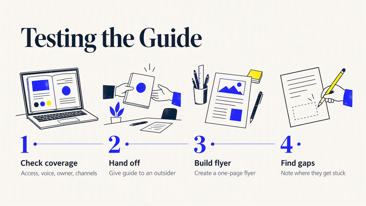
A checklist of topics is not enough. HubSpot’s brand style guide worksheet suggests auditing practical questions: can contractors find the guide, does it include behavioral voice examples and channel-specific rules, does it have a named owner and a review reminder, and does it cover every channel you actually publish on. Hand the guide to someone outside the team and ask them to build a one-page flyer. Where they get stuck is where the guide is thin.
Accessibility belongs in the color section
The Texas Department of Transportation’s brand review checklist is a public-sector example of review in practice. It emphasizes consistent headline hierarchy, logical structure, accessibility requirements, and avoiding decorative elements that reduce readability. Even if you are not a public agency, list approved text and background color pairings with contrast guidance, so designers do not have to guess.
Extend the guide to video, photography and events
Most brand guides are written by designers for designers, and they end at the website and the business card. Yet the content that reaches the most people is often video and photography: a brand film, a conference recap, headshots, a run of social ads. If those crews do not know your standards, you pay for it in edits and reshoots.
Canva’s brand style guide advice recommends adding photography and videography guidance that covers style references, examples, project-specific use, event-photography tips, technical specifications, editing do’s and don’ts, and links to photo and video files. It also stresses that visual examples matter especially for photographers and videographers, so specifications should be paired with references that show the intended result.
In practice, a useful motion and photo section includes:
- Reference frames. Five to ten stills from past work that show the look you want, plus a few that miss it.
- Camera and lighting direction. Natural or controlled light, depth of field, framing, color grade.
- Motion rules. Logo animation, lower-third style, transitions, title cards, music and pacing.
- Technical specs. Aspect ratios and resolutions for each platform you publish on.
- People and place. How to portray employees and customers, wardrobe guidance, locations to prefer or avoid.
- Event standards. Signage placement, stage branding, what the crew should capture, and who approves selects.
- Delivery. File naming, folder structure, and where finals are stored.
Red Caffeine’s checklist for brand standards lists applications across business papers, websites, print and digital marketing, social media, video, trade shows and events, promotional items, signage and vehicles. Use that as a prompt to find the gaps in your own guide.
If you want to see how brand direction translates into finished video work, our B2B video campaign examples show how different formats serve different goals, and our page on brand storytelling video explains how we turn brand foundations into narrative.
Keep it alive: governance and updates
The most common failure is not a bad guide but an abandoned one. Brandfolia’s handoff checklist recommends assigning a document owner, a revision date, an approval status, an asset location and a change-approval process, and testing real files, contrast, print dimensions, bleed, safe areas and crops. Frontify’s examples add the idea of a “what’s new” section so internal teams can maintain the guide without outside help and avoid the stale-PDF problem.
A simple routine works for most mid-sized companies:
- Name one brand owner and one backup.
- Put the live guide and asset library in a single location, and retire old copies.
- Review twice a year, and after any campaign that introduces new formats.
- Log changes with dates.
- Require approval for any new application type, such as a new event format or video series.
What does a brand guide cost?
Published prices vary widely, and a headline number rarely tells you what is inside. What moves the price is scope. Consider these drivers when you request a quote:
- Starting point. Documenting an existing identity costs less than building a new one.
- Depth of the visual system. Logo suite, color, type and imagery rules are the baseline. Motion, illustration and icon systems add work.
- Applications. Every template you want designed, from decks to event signage, adds scope.
- Channels and markets. More channels, languages and regulatory contexts mean more rules to write and test.
- Format. A PDF is simpler than an online portal with searchable assets.
- Photo and video direction. Reference shoots and motion standards add production time.
We do not publish set prices, because projects differ so much in scope. The most useful step is to share your channels, your current assets and your goals, and ask for a scoped proposal that itemizes each deliverable so you can compare like with like.
Our perspective
We see brand guidelines fail in the same place again and again: they are written for the logo and the website, then a video crew or event photographer shows up with nothing to go on. The result is footage that is well shot but off-brand, and a lot of expensive editing to fix it.
Our view is that a guide should be judged by the work it produces. Does a banner at a conference match the brand film that plays beside it? Do corporate headshots look like they belong with the product photography? Those questions are about business outcomes, because consistent presentation builds recognition and trust, and trust supports leads.
That is why we start projects by understanding your goals and audience, then filter creative decisions through what the business needs. When a guide includes reference frames, motion rules and event standards, our crews across the country can shoot to the same bar in any city, and your team spends less time in review.
Brandon V
Put your guidelines on screen
A guide shows its value when it meets a camera. If your brand standards are ready, or you want footage that helps you define them, we can produce corporate and marketing video, corporate and marketing photography, and event coverage that follows your visual identity from the first frame.

We work with marketing teams, event organizers and corporate brands on project-based engagements, and our network of professionals lets us staff shoots in major cities. Talk to us about your next shoot and bring your guide, or tell us it needs work and we will start there.
FAQ
What is the difference between brand guidelines and a brand style guide?
The terms overlap, and many companies use them interchangeably. A style guide usually covers the visual and verbal rules: logo, color, type, imagery and voice. Brand guidelines often go wider, adding the brand core, applications, and governance such as approvals and ownership.
How many pages should a brand guide have?
There is no ideal length. Depth should follow your channels, teams, suppliers and markets. A small company can be well served by a short, example-rich document, while a multi-market brand needs more detailed specifications and templates.
Should brand guidelines cover video and photography?
Yes, if you publish either. Add reference images, technical specs, editing do’s and don’ts, and event-photography notes, and link to the actual files. Specifications alone are not enough, because crews need to see the intended result.
Who should own the brand guidelines?
Assign a named owner, usually in marketing or brand, with a backup. That person approves new applications, schedules reviews, and makes sure the current version and assets sit in one findable place.
Do I need AI rules in my brand guide?
If anyone on your team or among your vendors uses generative tools, yes. Set out which tools are allowed, which sources are approved, and that a person reviews output before it is published.
Sources
- AIGA identity guidelines, December 2015
- Apple brand standards, May 1993
- 19 brand guidelines examples from brands that get it right
- Brand guidelines: what they are and what to include
- Brand guidelines: how to create a style guide
- AMA sample style guide template
- Brand guidelines definition
- Brand style guide worksheet
- Brand review checklist
- How to create a brand style guide
- Checklist: key elements for effective brand standards
- Brand guidelines checklist: handoff checks