



A homepage introduces your whole business and sends visitors to the right place. A landing page has one job: getting a visitor to take one action, such as filling in a form, booking a call or downloading a guide. Most companies need both, and the decision comes down to where the visitor is coming from and what you want them to do next.
This guide explains the difference in practical terms, shows when each page earns its place, covers where a microsite fits, and looks at how video changes the performance of a landing page.
TL;DR
- A homepage is the front door to your site. A landing page is a focused page built around a single action.
- Send paid ads, email campaigns and other campaign traffic to a landing page. Send branded search and general browsers to the homepage.
- A microsite sits between the two: a small, separate site for a campaign or event that needs more than one page.
- Video can help a landing page when the offer is complex or when trust matters. Place it high on the page and test it.
- Measure play rate, conversion rate and the leads that result, not views alone.
Table of Contents
- What each page is for
- When to use a landing page
- When the homepage is the right destination
- Why most businesses need both
- Where a microsite fits
- Microsite vs full website
- Adding video to a landing page
- Measuring whether it works
- Our perspective
- How V2 Visuals can help
- FAQ
- Sources
What each page is for
The cleanest way to separate the two is by purpose. Search Engine Land’s landing page guide describes a homepage as the page that welcomes visitors, introduces the company and its products or services, and encourages exploration. A landing page narrows attention to one action: submitting a form, registering, downloading, starting a trial or buying.
That difference in purpose drives every other difference in design:
- Navigation. A homepage links out to services, case studies, about pages and contact details. A landing page strips most of that away. Semrush’s overview of landing pages notes that homepages can point visitors to other pages, while landing pages minimize navigational elements.
- Message. A homepage speaks to everyone who might care about your business. A landing page speaks to one audience about one offer, usually matching the ad or email that brought them there.
- Call to action. A homepage can carry several, such as “See our work,” “Get a quote” and “Read the blog.” A landing page repeats one.
- Traffic. A homepage receives a mix of branded search, direct visits, referrals and social clicks. A landing page typically receives traffic you have chosen and paid for or sent yourself.
A side-by-side view
| Homepage | Landing page | |
|---|---|---|
| Main goal | Introduce the brand and route visitors | Drive one specific action |
| Audience | Broad: customers, partners, job seekers, press | Narrow: one segment tied to one offer |
| Navigation | Full menu and footer | Minimal or none |
| Typical traffic | Branded search, direct, referrals | Ads, email, social campaigns, events |
| Calls to action | Several | One, repeated |
| Content | Overview of the whole business | Detail on one offer, proof and a form |
| Lifespan | Long-term, updated gradually | Often tied to a campaign, tested and revised often |
One caution: the line blurs in practice. A small business can make its homepage work as a landing page, and some landing pages live inside the main site. The useful question is not what the page is called but what it is built to do and who it is built for.
When to use a landing page
Use a landing page whenever you are paying for, or personally directing, traffic toward a specific outcome. ActiveCampaign’s guidance says links from PPC, search ads, social ads, email or podcast advertising should generally lead to a dedicated page whose message and call to action match the campaign, not to a generic homepage.
That covers most of the situations a B2B marketing team faces:
- A paid campaign for a single service, such as corporate video production for a product launch.
- A webinar, conference or trade show registration.
- A gated guide, case study or checklist.
- A demo or consultation request.
- An event follow-up, where attendees receive a link to highlights and a next step.
The reasoning is simple. Someone who clicked an ad about one service arrives with one question in mind. If they land on a homepage with eight menu items and six competing messages, you ask them to do the work of finding the answer. Many will not.
If you are building or fixing a page like this, our guide on how to optimize landing pages for more leads walks through the elements that matter most.
When the homepage is the right destination
The homepage is still the right place for people who are exploring. That includes visitors who search for your company name, people who follow a link from a directory or press mention, and anyone who wants to understand the whole range of what you offer before committing.
There is also a risk in sending the wrong traffic to a landing page. A write-up from Perceptra on choosing between the two points out that sending general research traffic to a narrow, sales-focused page can feel like a premature sales push. Someone reading an educational article is not ready for a hard sell. Let them continue to learn on the site first.
A practical rule:
- If the visitor already knows what they want, give them a landing page.
- If the visitor is still working out who you are, give them the homepage.
- If you are not sure, start with the homepage and watch where people go next.
Why most businesses need both
The two pages serve different stages of the buying journey. HubSpot’s comparison of landing pages and websites concludes that most businesses should use both: the website for brand presence and landing pages for specific marketing campaigns.
A typical B2B sequence looks like this:
- A marketing manager sees a LinkedIn ad about event videography and clicks through to a landing page with one offer and one form.
- Another prospect hears your name from a colleague, searches for it and arrives on the homepage.
- Both end up in the same place: a conversation about scope, timeline and goals. The route is different, and so is the page that serves them best.
The homepage builds credibility over time. The landing page converts attention you have already earned or bought. Neither replaces the other.
Where a microsite fits
The keyword question often grows into a third option: a microsite. It is worth understanding because it solves a problem neither page handles well.
Per CMSWire’s comparison, a landing page is generally one page with one primary conversion goal and is commonly hosted within the main website. A microsite is a smaller, separately structured web presence that can contain several pages, its own navigation and often its own domain or subdomain. One 2026 guide describes a microsite as a self-contained site, typically 3 to 10 pages, built for a campaign or initiative and sitting between a landing page and a full corporate site in scope.
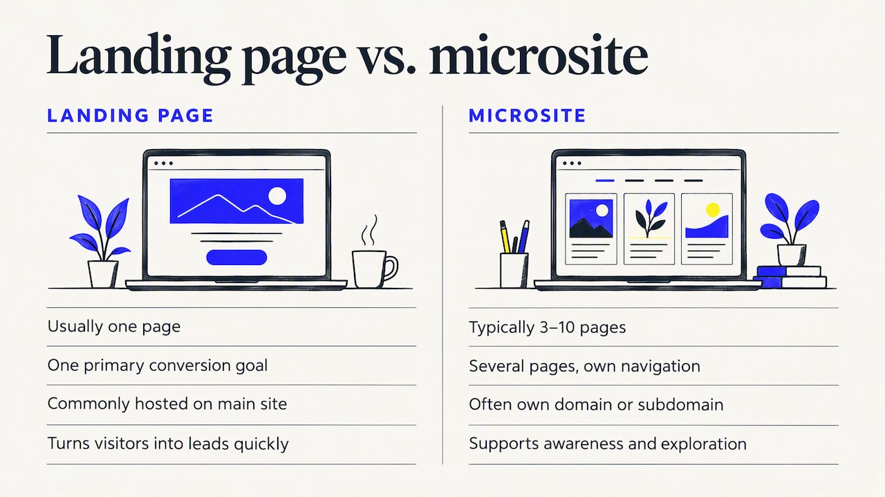
The practitioners quoted by CMSWire frame the trade-off as conversion versus education. Landing pages are better at turning visitors into leads quickly. Microsites suit broader awareness and interactive exploration.
Choosing between the three
| Situation | Best fit |
|---|---|
| One offer, one audience, one action | Landing page |
| A campaign with several stories, videos or audiences | Microsite |
| A multi-day conference or event with agenda, speakers and registration | Microsite or a dedicated event section |
| Overall brand, services and company information | Main website with a homepage |
| Branded search and general browsing | Homepage |
A microsite is also the natural format for focused projects such as a single property website, where one asset gets its own small site instead of a page buried in a larger one.
For most teams, the landing page is the faster and cheaper starting point. Move to a microsite when the story genuinely needs several pages, rich media or a separate identity. Build a microsite only when you can name the content that justifies each page.
Microsite vs full website
A full website is the interconnected collection of pages that covers a brand comprehensively: services, contact details, a content library and more. A microsite is narrower and temporary by design. It carries one campaign, product launch or initiative, and it can be retired or folded into the main site when the campaign ends.
If you need the long-term foundation, invest in the main site first. Our comparison of a custom website versus templates explains what changes when a site is built around your brand and lead goals instead of a stock layout.
Adding video to a landing page
Video is one of the strongest tools you can add to a focused page, but only when it supports the single action the page is built for.
When video helps
According to CXL’s research on optimizing videos for conversions, video can help explain complex or new products and can introduce the people behind a service company. Those two uses map neatly to B2B services:
- Explaining an offer. If your service takes three paragraphs to describe, a 60-to-90-second film can show it.
- Building trust. A short introduction to your team or a client testimonial answers the question every buyer has: who will I be working with?
Formats worth considering include a customer testimonial video, a brand story or a concise explainer. Our overview of the best corporate video formats for growth compares them by goal, and the B2B video campaign examples show how teams have used them.
Placement and size
The same CXL analysis found that videos placed higher on a page are more likely to be played, and that player widths of 401 to 600 pixels can increase play rates. It also stresses that testing is needed to find what works for your audience. Treat those figures as a starting point for your own tests, not a rule.
Google’s own research on video ads points the same way on size: Think with Google’s viewability study suggests that larger player sizes generally show higher viewability, and that small formats like 300×250 often perform worse. That study concerns video ads, so apply it as a reminder not to shrink your player into a corner.
Speed and clarity come first
Video adds weight, and weight slows a page. Jakob Nielsen of the Nielsen Norman Group found that users rate fast download speed as significantly more important than aesthetic design for their overall satisfaction with a site. It is an older study, but the principle holds for a page with an embedded film. A separate Nielsen Norman Group piece reports that users have little patience for poorly organized pages and trust well-organized ones more.
In practice:
- Compress the file and use a hosted player that loads progressively.
- Set a clear poster frame so the page looks finished before the video plays.
- Add captions, since many visitors watch without sound.
- Keep the form, headline and call to action visible without scrolling past the film.
- Do not autoplay a long video that pushes the form below the fold.
What a good landing page video does
We look for four things when we plan one:
- It repeats the promise made in the ad or email, so the visitor feels they are in the right place.
- It shows the outcome, not just the process.
- It runs short enough to finish, with the call to action at the end and next to the player.
- It matches your brand guidelines so the page and the film feel like one piece.
CXL points to a newsletter tool’s homepage video that carries its value proposition straight into the film. The lesson applies to any page: the video should extend the headline, not introduce a new idea.
Measuring whether it works
A landing page with video can look polished and still underperform. Measure it.
According to CXL, businesses can track play rate, watch rate, conversion rate and revenue using native player analytics, Google Analytics or Google Tag Manager. Semrush adds time on page, engagement rate, heatmaps and session recordings to the toolkit.
A simple measurement plan:
- Play rate: the share of visitors who press play. A low rate suggests the thumbnail, placement or headline needs work.
- Watch rate: how far viewers get. A steep drop at a specific second suggests a pacing problem.
- Conversion rate: form submissions or bookings per visit. Compare visitors who watched with those who did not.
- Lead quality: whether the leads become conversations and contracts.
When you want a reference point, a set of conversion rate benchmarks can help you judge whether your numbers are healthy for your industry, though your own history is the best benchmark.
To tell whether the video itself caused a change, run a controlled test. Think with Google’s guidance on proving marketing impact explains that controlled experiments can determine the incremental effect of media spend, including video, on visits and conversions. In landing page terms, that means an A/B test: the same page with and without the video, with traffic split evenly.
We cover the reporting side in our guide to measuring video leads and proving ROI.
Our perspective
We see the same pattern across corporate and event clients. A company runs a good campaign, then sends every click to the homepage and wonders why the leads are thin. The homepage was never designed to close a specific conversation.
Our approach starts with the business outcome and works backward. What action do you want, from whom, and what does that person need to see in the first ten seconds to take it? Often the answer is a focused page with a short, well-made video that speaks to one audience. Sometimes it is a small microsite for an event with its own highlights, speakers and registration.
Because we handle video, photography, ad creative and website development together, the film, the images and the page are planned as one system instead of three handoffs. That keeps the message consistent from the ad to the form, and it makes results easier to trace.
Brandon V
How V2 Visuals can help
If you are planning a campaign page, a product launch or event coverage, we produce the assets that make those pages convert: brand films, marketing videos, event highlights, commercial photography and ad creative, backed by a nationwide network of professionals.

See our video production services for corporate and marketing films, or visit V2 Visuals to tell us about your project. If the page itself needs work, our custom website and app development team can build it around your lead goals. For a real example of a site rebuilt to turn visits into enquiries, read our website redesign case study.
FAQ
Is a landing page the same as a homepage?
No. A homepage introduces the whole business and routes visitors to other pages. A landing page is built around one offer and one action, with minimal navigation. A homepage can be made to work like a landing page on a very small site, but they are designed for different jobs.
Do I need both a landing page and a homepage?
Most businesses do. The homepage supports brand presence and general exploration, while landing pages carry specific campaigns. If you run no paid or targeted campaigns, a strong homepage may be enough to start. Add landing pages as soon as you send traffic toward a particular offer.
Should I put a video on my landing page?
It helps when your offer is complex or when trust is the barrier. Keep it short, place it high on the page, add captions and keep the call to action visible. Test the page with and without the video, because the right answer depends on your audience and offer.
When should I choose a microsite over a landing page?
Choose a microsite when a campaign needs several pages, such as a conference with an agenda, speakers, galleries and registration, or a product launch with multiple stories. If you have one offer and one action, a landing page is faster to build and easier to optimize.
Sources
- What Is a Landing Page? Build Pages That Convert, Search Engine Land
- What is a landing page? What to know + examples, Semrush
- When to Use Landing Pages to Capture and Convert Leads, ActiveCampaign
- When to Use a Landing Page vs a Homepage, Perceptra
- Landing Page vs. Website: What’s the Difference?, HubSpot
- Microsite vs. Landing Page: What’s The Difference?, CMSWire
- Landing Page vs Microsite: How to Choose, roast.page
- How to Optimize Videos for Conversions, CXL
- Are Your Video Ads Making an Impression?, Think with Google
- Usability Insights From Sun Microsystems’ 1997 Web Design, Nielsen Norman Group
- Iterative Design of Sun’s Website and Home Page, Nielsen Norman Group
- Are your marketing dollars effective?, Think with Google
- Single Property Website: What It Is and How to Automate It