


A logo is a single graphic mark that identifies your business. A brand identity is the full system around that mark: color, typography, imagery, voice and the rules for using them together. The logo is one part of the identity, and it cannot do the identity’s job alone. If your company is deciding what to invest in first, or what to ask a creative partner for, this distinction shapes the scope, the budget and the results.
TL;DR
- A logo is a symbol that identifies you. A brand identity is the set of visual and verbal elements, including the logo, that makes your company recognizable everywhere it appears.
- Your brand is the perception people hold. Your identity is what you control to shape it. Branding is the ongoing work of applying that identity.
- A working identity includes a logo system, color palette, typography, imagery direction, voice and written guidelines.
- Guidelines let your team, vendors and video crews produce on-brand work without guessing.
- Plan your identity before you commission video, photography or ads, so every asset looks like it came from one company.
Table of Contents
- Logo vs. brand identity at a glance
- What a logo does
- What a brand identity includes
- Brand, branding and brand identity: three terms people mix up
- Why a logo alone isn’t enough
- Brand guidelines: where the identity becomes usable
- Examples of brand identity in action
- Applying your identity in video and photography
- How to build or strengthen your identity
- Our perspective
- Put your identity to work
- FAQ
- Sources
Logo vs. brand identity at a glance
The quickest way to see the gap is side by side.
| Logo | Brand identity | |
|---|---|---|
| What it is | One graphic mark (symbol, wordmark or both) | The system of visual and verbal elements that represent the brand |
| What it contains | Shape, lettering, sometimes an icon | Logo variations, colors, typography, imagery, voice, layouts, rules |
| Job | Identify you quickly and support recall | Make every touchpoint look and sound like the same company |
| Where it lives | Website header, packaging, signage, social avatar | Websites, video, photography, decks, packaging, email, events |
| Typical deliverable | Logo files | Logo system plus brand guidelines and templates |
| Who uses it | Anyone placing your mark | Marketing, sales, designers, agencies, production crews |
A useful way to think about it: the logo is the signature, and the identity is the handwriting, the stationery and the way you speak. People recognize you from all of it together.
What a logo does
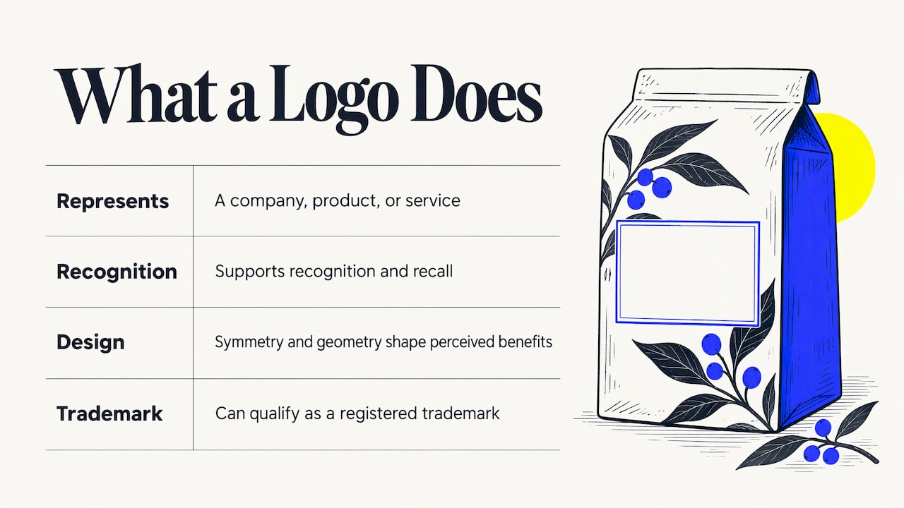
A logo is a visual symbol that represents a company, product or service. Penn State Extension describes it as visual shorthand that supports recognition and recall across advertising, packaging, websites and social media, while noting that it is only one facet of a broader branding strategy.
That shorthand is valuable. A clear, well-built logo is the thing customers see first and most often. Research published by the American Marketing Association suggests that visual design properties such as symmetry and geometry can influence how consumers perceive a brand’s benefits. So the logo matters. It just isn’t the whole job.
A logo can also be a legally protected asset. The American Marketing Association explains that a registered trademark is a word, name, symbol or device that identifies and distinguishes the source of goods, and a logo, slogan or package design can all qualify. If your mark is central to your business, talk with a trademark attorney about protecting it.
What a brand identity includes
The American Marketing Association’s definition of brand identity covers the visual and symbolic elements that represent a brand, including its name, logo, color scheme, typography and design elements, which together create an image people can recognize and connect with.
In practice, most identities are built from the following components.
Logo system
Not one file, but a family: primary and secondary versions, a compact icon for small spaces, versions for light and dark backgrounds, and clear rules for spacing and minimum size. A single logo that only works on white paper will fail the moment it appears on video, a trade show banner or a phone screen.
Color palette
A defined set of primary and supporting colors with exact values for screen and print. Consistent color is often the fastest route to recognition, because people register color before they read a word.
Typography
The typefaces you use for headlines, body copy and on-screen text, plus a hierarchy that says what size and weight goes where. This is the element video editors and motion designers lean on most for titles and lower thirds.
Imagery direction
The look of your photography, video and illustration: lighting, framing, subjects, level of polish, and how people and products are shown. This is where identity moves from a design file into the content that sells.
Voice and tone
The way your company writes and speaks. Shopify’s guide to logos and branding lists the logo, colors, fonts and the voice and tone of copy among the elements that communicate a company’s values and personality. Voice covers scripts, captions, headlines and how presenters talk on camera.
Brand values and positioning
Adobe notes that identity also includes intangible assets such as values, mission, personality and culture, and that the logo should align with that overall identity. These are the decisions that make the visuals mean something. A palette and a typeface can look good and still say nothing about who you are.
Brand guidelines
The document that holds all of it together. We cover this below, and our own brand guidelines examples show what makes them work in the real world.
Brand, branding and brand identity: three terms people mix up
These words are often used interchangeably, and that is a big source of confusion when scoping a project.
- Brand: how people perceive your company. You influence it, but customers own it.
- Brand identity: the tangible and verbal elements you create and control to shape that perception.
- Branding: the ongoing work of using those elements consistently across every channel.
The Penn State Extension article makes the same point: a brand reaches beyond visuals into emotions, values, personality and experiences. The identity is the part you can design, document and hand to a team.
So when a stakeholder says “we need a rebrand,” ask what they mean. Sometimes the answer is a refreshed logo. More often, it is a missing system: the company has a mark, but no agreed colors, no rules for imagery and no template anyone follows.
Why a logo alone isn’t enough
Imagine a company that has a clean logo and nothing else. Its website uses one blue, the sales deck another. The trade show booth uses a different typeface from the product video. Each piece may look fine by itself, but together they read as three different companies.
Here is what a complete identity solves.
- Consistency across touchpoints. Customers meet you on a website, in an ad, at an event, in an email and on video. A shared system makes those meetings feel connected.
- Speed for your team. When colors, fonts, layouts and logo rules are documented, new assets don’t need a designer’s sign-off every time.
- Cleaner handoffs to vendors. Photographers, videographers, printers and web developers can follow the same rules from day one, which cuts revisions.
- Flexibility without drift. A good system leaves room to adapt to new channels while keeping the core recognizable.
AIGA’s Eye on Design describes how Spotify’s brand guidelines work as the foundation for its design elements, giving the brand room to flex while core assets such as colors and typography stay consistent. That is the balance to aim for: fixed core, flexible expression.
A system can also simplify. In 2016, Tate refreshed its identity to improve coherence across its galleries, reducing its logo to a single, versatile version that works in physical and digital settings. Sometimes a stronger identity means fewer variations, not more.
Brand guidelines: where the identity becomes usable
An identity that lives only in a designer’s head won’t survive contact with a busy marketing team. Guidelines turn it into something anyone can apply.
The American Marketing Association’s style guide template advises organizations to centralize core brand elements, including logo rules and color codes, in one document. Guidelines also protect the logo itself. AIGA’s Eye on Design points out that applying a logo correctly means following rules, such as not distorting, rotating, blurring or adding effects to the mark.
A practical set of guidelines usually includes:
- Logo versions, clear space, minimum sizes and misuse examples
- Color values for digital and print
- Typefaces, sizes and hierarchy
- Photo and video style notes
- Motion rules: how titles animate, how logos appear and end cards
- Voice and tone with sample phrases
- Templates for decks, social posts and email
The motion and video notes are the part most companies skip, and the part that matters most once you start producing content at volume.
Examples of brand identity in action
The Spotify and Tate examples above show two sides of the same idea. One uses guidelines to stay recognizable while changing constantly. The other simplifies a logo system to work across many places.
For your own company, a quick audit makes the concept concrete. Pull up your website homepage, your most recent sales deck, your last social post and your last video. Then ask:
- Do the colors match exactly, or only roughly?
- Do the same typefaces appear everywhere?
- Does the logo appear in the same way, with the same spacing?
- Does the tone of the writing sound like one company?
- Would a stranger say these four items came from the same business?
If the answer to the last question is no, you have an identity gap, not a logo problem. Fixing the gap usually costs more than a logo, which is why many teams ask what brand identity costs for US businesses before they scope the work.
Applying your identity in video and photography
This is where identity pays off most visibly. A promotional video, a corporate headshot session or an event recap is a brand touchpoint, and each choice either reinforces your identity or weakens it.
Before the shoot
Share your guidelines with the production team early. The useful items are the logo files, color values, typefaces for on-screen text, the tone of voice for scripts and any examples of imagery you like. When a crew knows your palette, they can plan wardrobe, set dressing and lighting that fit it, rather than correcting color in post.
On set
Imagery direction guides framing, locations and how people appear on camera. A brand that presents itself as warm and approachable will shoot differently from one that wants a precise, technical feel. For events, this means deciding in advance how banners, stages and signage will read on camera.

In editing
Titles, lower thirds, transitions, music mood and end cards all come from the identity. This is also where logo versions matter: a light-background version for white end cards, a reversed version for dark footage, and a compact icon for social crops.
Across channels
One shoot can produce a hero film, short social cuts, still photography and ad creative. Consistent identity keeps all of those recognizable as one campaign. Our brand story video production work is built on this idea: the story and the look come from the same source.
How to build or strengthen your identity
Whether you’re starting from scratch or tightening what you have, this order tends to work.
- Define the foundation. Write down who you serve, what you stand for and how you want to be perceived. Visual choices follow from this.
- Audit what exists. Collect every logo version, color and font currently in use. Note the inconsistencies.
- Design or refine the core system. Logo family, palette, typography, imagery style and voice.
- Document the rules. Put everything into guidelines, with examples of correct and incorrect use.
- Build templates. Decks, social graphics, email layouts and video title packages save your team time every week.
- Produce content against the system. Commission video and photography that follows the guidelines, then review the first round and refine the rules where real use shows gaps.
- Maintain it. Assign someone to own the guidelines and update them as channels and products change.
Our perspective
We see the same pattern with marketing teams again and again. A company invests in a logo, then discovers that the logo doesn’t tell a crew how to light an interview, how a product should be framed, or how a title should animate. The logo was never meant to answer those questions. The identity is.
Our approach is to treat identity as the input to everything we create. Strategic creative work should be filtered through business outcomes, so we start by understanding your goals and your audience, then build visuals that serve both. A brand film, a set of corporate headshots and a campaign of ad creatives should look like one company because they were made from one system.
That is also why we work across branding, video, photography and creative production rather than treating them as separate purchases. When one team understands the identity, the content that carries it stays consistent, and consistent content is easier to connect to leads and growth.
Brandon V
Put your identity to work
If you already have a logo and guidelines, the next step is content that carries them well. We produce corporate, marketing and branding video, along with photography, event coverage and ad creative, for businesses and marketing teams across the United States, drawing on a network of professional crews in major cities.

If your identity is still a logo and a few loose files, we can help you define the creative direction before the cameras roll. Tell us about your goals on our site and we’ll talk through what your project needs.
FAQ
Is a logo the same as a brand identity?
No. A logo is one graphic mark. A brand identity is the whole system of visual and verbal elements that includes the logo, plus color, typography, imagery, voice and the rules for using them. The logo is part of the identity, not a substitute for it.
What are the main components of a brand identity?
Most identities include a logo system, a color palette, typography, imagery direction and a defined voice, held together by written brand guidelines. Many also document values, mission and personality, since those guide every visual and verbal decision.
What is the difference between brand, branding and brand identity?
A brand is how people perceive your company. Brand identity is the set of tangible elements, such as logo, colors and typography, that you create to shape that perception. Branding is the continuing work of applying those elements consistently across your channels.
Do I need brand guidelines if I only have a small team?
Yes, and small teams often benefit the most. A short document with logo rules, colors, fonts and voice notes keeps every post, deck and video consistent, and gives freelancers and production crews a clear reference from the first day.
Should I finish my brand identity before producing video?
It helps a great deal. Colors, typefaces, logo versions and tone of voice feed directly into scripts, on-screen graphics and shot design. Having them defined first means fewer revisions and a final video that looks like the rest of your marketing.
Sources
- Unveiling the Divide: Brand vs. Logo, Penn State Extension
- Branding, American Marketing Association
- What is a Trademark? The AMA Guide for Marketers
- How Effective Logos Shape Consumer Beliefs, American Marketing Association
- AMA Sample Style Guide Template
- What is Brand Identity? Design Guide, Adobe
- Logo and Branding: How To Make Them Work Together, Shopify
- Inside the World of a Spotify Brand Designer, AIGA
- Tate Galleries Get a Graphic Design Face Lift, AIGA Eye on Design
- What Not to Do to a Logo, AIGA Eye on Design